Mark Galezo and Associates

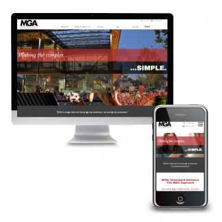
Visit MarkGalezo.com The Challenge Mark Galezo, of Mark Galezo and Associates, reached out with questions about his website; he couldn’t figure out why he was not getting any traffic to his website. He had worked with a couple of other vendors but did not feel he had a clear picture of what they had done or where he stood. Nor did he feel he had a trusted resource to look into these issues on his behalf. With no information beyond what Mark was able to share over the phone, we needed to do more digging to find out what was happening before we could make recommendations for improvement. Solutions Based on our initial conversation, we recommended starting with a Marketing Audit. This would allow us to get in “under the hood” and do a thorough assessment of the website’s front and back ends, as well as his Google and social…
Read More

Continue reading

Launch Boutique

Visit – and shop – LaunchBoutique.com The Challenge Opening an online and brick-and-mortar store during a pandemic is not for the faint of heart! The client had a vision, however, and boldly moved forward. We needed to create an ecommerce website that would feature a limited number of products and categories to start but grow over time. The client would be adding products and maintaining inventory herself and wanted to make sure the interface would be simple to use but still have all the features she needed. Solutions WordPress and WooCommerce allowed us to create an attractive, easy-to-maintain online shop. Products can easily be listed as on sale via the dashboard. On the front-end, sale items are then featured on the home page and a dedicated sale page. Extensions allow for integrated shipping calculations, printing labels and coupons. Key Successes A written User Guide allows the client to confidently manage…
Read More

Continue reading

Stray H.E.L.P.

Visit StrayHELP.org The Challenge Stray H.E.L.P.’s website lacked clear, concise messaging. Every page appeared in the main menu making it difficult to discern relative priority of information. Additionally, a number of technical issues made the site difficult to update and maintain on the backend and plagued the user experience on the front end. Solutions An in-depth marketing questionnaire provided an opportunity to reflect on key services the organization provides. The information collected was used to create a content strategy that became the foundation of the new website content structure. Copyediting content brought key messaging to the fore and simplified the writing throughout the site. PDF forms were converted into online forms allowing the organization to move towards a paperless system and eliminated the need for volunteers to enter data into spreadsheets. Key Successes The adoption and foster application forms were extensive. By using conditional logic and reordering the fields, the…
Read More

Continue reading

PFS Foundation

Visit PFSFoundation.org The Challenge The PFS Foundation’s new website had been stalled for a while and communication with their web developer was sporadic. We were able to get the site launched but the work was not done! Content needed to be translated into multiple languages, and “wish list” features, such a a Patient Quilt of letters from PFS patients and family could be shared, were yet to be included. Solutions The first order of business was simplifying the overly-engineered WordPress website. We were able to remove much of the custom-coding that was preventing staff from being able to update content. With the initial work done, we were able to implement a “phase one” launch, making critical information available to readers right away. Subsequent phases included adding additional languages as translations become available. The site is now available in Spanish, Chinese, Russian, and Hindi. A “Patient Quilt” of letters from patients…
Read More

Continue reading

Mianus River Gorge

Visit Mianus.org The Challenge Mianus River Gorge is a private, not-for-profit nature preserve and conservation organization; but you wouldn’t know it from their old website. The website mainly focused on the hiking trails and only a subset of the diverse programs and research being done. A previous malware infection left the site difficult to update. As a result, much of the content was old and the look and feel were dated. Solutions Using bold images and simple copy we put the organization’s mission center stage. Program areas showcase the research and conservation work of the organization from the site navigation. A content strategy, based on program areas, keeps the site well organized and provides a structure for new content to be added over time. Key Successes Photos taken at the Gorge add significant visual impact and highlight the beauty of the Preserve. The new page structure – to say nothing…
Read More

Continue reading

Support Connection v2

Visit SupportConnection.org The Challenge Westchester Marketing Cafe redesigned the Support Connection website over four years ago and while the page structure stood the test of time, the site was looking a bit dated. Online payments were also a challenge because the original theme did not play well with the payment gateway. As a result, online sponsorship payments and donations were problematic; a significant hurdle especially once COVID hit and virtually all events went online. We wanted to leave most of the current content intact. This meant we needed to update the look without reformating every page. Finally, essential features, such as site search, the support number, and a link to information about the new retail shop needed a more prominent place on the site. Solutions We began by creating a new theme that leveraged the technical improvements in WordPress since the last redesign. The new theme and limited use of…
Read More

Continue reading
upLIGHT project featured image

Michael Stiller

Visit MichaelStiller.com The Challenge The team at upLIGHT had a simple and elegant looking website. They still liked the design aesthetic even though the site had been designed a few years back. But the site was built without a Content Management System (CMS) and as a result, adding new projects to their portfolio required hiring a professional. Because of this updates to the website were often pushed to the back burner. The Solution They called Westchester Marketing Cafe to make some basic updates on the website. Rather than focusing on just making the changes, however, we were able to provide a longer-term value. We migrated the entire site to a CMS, in this case, WordPress, that would allow the client to make changes themselves. The budget was kept in check by using many of the existing design elements and the content that was still current. We were able to improve…
Read More

Continue reading

Wellsoft

The Challenge Wellsoft.com was built on a relatively unknown Content Management System which was difficult to add new content and attract new prospects. With limited lead generation and lead capture forms it was challenging to identify and follow up with prospects. The non-mobile-friendly framework negatively impacted the site’s placement in the search engines and made it harder for visitors on mobile devices to engage with the site. Solutions We focused on three fundamental elements for the new website: messaging, lead capture and mobile-friendliness. The messaging was written, and pages organized, to address concerns specific to various decision-makers. Within the messaging was a call-to-action encouraging readers to request a demo, which then captured contact information allowing the sales team to follow up. A mobile-friendly website was a must-have for search engine optimization as well as site usability, especially given the high number of international visitors who were more likely to be visiting…
Read More

Continue reading

Miller Grossbard Advisors

Visit MGALLP.com The Challenge Miller Grossbard Advisors, LLP (MGA) had been serving the Houston-area for decades. Their clients had grown to rely on them for much more than tax and accounting however. MGA needed their website to reflect not just their full range of advisory services but their unique personality. An ordinary website would not do. Solutions We worked with MGA to create a simple website with a very modern feel that reflected their mission of  making the complex simple. Taking inspiration from the advertising sector, we used great visuals to help tell their story. Key Successes Strong VisualsWith attention spans at a minimum and competition around every corner, standing out in the crowd is very difficult. We made this possible by using images, as well as words, to tell the story. Thought LeadershipMGA’s is full of innovative, forward-thinking professionals. With all that talent, they are committed to being thought…
Read More

Continue reading
Accreditation Guru website screenshots on desktop and mobile device

Accreditation Guru

The Challenge Three years after we merged Accreditation Guru’s old website and blog into a single platform, it was time to give the site a fresh look! The original design was fussy relative to the clean, pared-down aesthetic that had become popular. Solutions The website redesign built on the original style standards but focused on simplifying the look and the copy. This approach created consistency in branding between the old site and the new but eliminated distractions that could divert readers. Key Successes Building a new theme presented us with the opportunity to create a template for simplifying the creation of future landing pages. As Accreditation Guru expands its reach, this will allow for better tracking of paid marketing efforts. What You Can Learn Often a website redesign project, just like redesigning a room in your home, provides opportunities to address pesky problems. There may be a way to automate…
Read More

Continue reading