Visit SPOP.org
About 20% of adults will experience a mental health disorder. SPOP (Service Program for Older People) knows that therapy can be a highly effective pathway to emotional well-being, offering therapy for people ages 55 and older.
But the website was hard to use, especially for older adults.
The Process
Discovery
Through our Discovery process, we identified three key constituencies;
- Clients; Those who will be participating in programs or their families or caregivers
- Mental Health and Elder-care Professionals; those making referrals and those looking for continuing ed credits
- Donors
Content Strategy
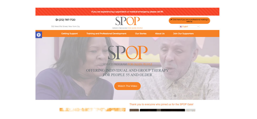
The site was organized around the key messages of “Getting Support” (our first segment) and “Giving Care” (the second segment), and of course the background information and donor participation options.
The home page features the organization’s new video to introduce SPOP to new clients and potential new referral partners. Below that is a section used for important announcements and updates which can be edited by staff as needed. (Within weeks of launch, it had been updated with a photo gallery from their gala!)
Back-office Features
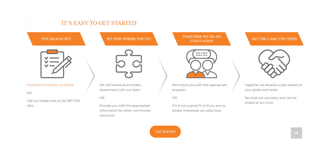
We pared down the copy on the Getting Support pages to a very simple outline of the onboarding steps and an online intake form. This reduced redundancies (“…for more information contact…”) on service pages and increased the efficiencies for office staff.
The Training section was similarly streamlined and an online request form was added.
We also added a section for the Board that would allow them to securely access a shared file drive.
Key Successes
Reimagining the site from the readers’ perspective, allowed us to streamline much of the copy from the old site. Specific solutions include:
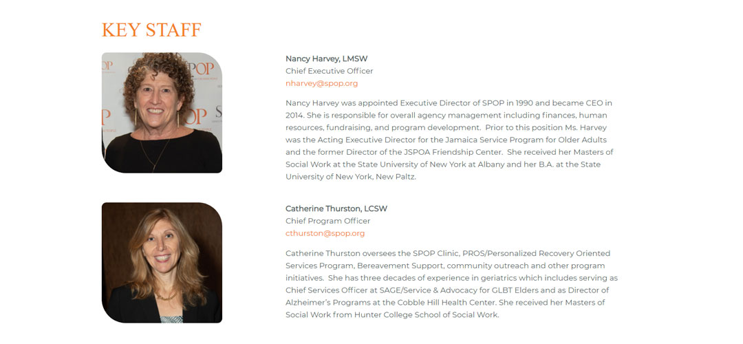
- Creating a more welcoming experience; photos of staff, simpler language and “next steps” gave way to a streamlined onboarding process.
- Leveraging online forms reduced clerical work for intake staff; collecting information online elminates paper forms and gets information into the right hands quickly
What Can You Learn?
The adage “less is more” is one that can certainly apply to website design. We often want to share every detail about every service we offer. Paradoxically, this can overwhelm readers and turn them off.
Keep it simple and let readers know vital information and what actions to take for the next steps.


